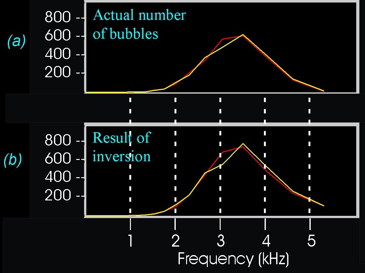
When this final time series is inverted, we obtained the
bubble population given in
(b),
the bottom graph (the red curve corresponding to the bubbles which are
generated in the first second of the hydrophone trace, and the yellow curve
of those generated in the second second).
Having in the bottom graph estimated the bubble population the
computer used to generate the time series, we can now look at the top graph
(a)
and see the actual bubble population the computer
had in mind. They match closely,
indicating that our inversion was successful.
