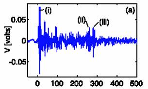
A typical output from the sensor (volts relating to acoustic pressure linearly) is plotted on the right (Figure 1). It shows a number of peaks. Why have three in particular [labelled (i), (ii), and (iii)] been identified as important?
It is because when the same data is plotted in time-frequency representation (Figure 2), the figure below clearly shows that the three peaks in question (i, ii, iii) contain significant broadband energy. What does this tell us about the processes going on at the lithotripter focus?
Well, the lithotripter pulse lasts for only a few microseconds, as shown below…
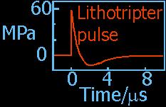 |
Figure 3. Schematic of an idealised lithotripter pulse. |
...but the bubble activity lasts for much longer, and, as will be shown on the next slide, this explains the form of Figure 2.

For the
homepage of the Ultrasonics and Underwater Acoustics (UAUA) Centre, click ![]()
© T G Leighton 2003